March 22 2014
Nursery Crush
It’s true. I’m obsessed with neutrals right now. And, I’m not alone. After years of brights dominating the home market, it was only natural to see a shift towards less color. But for many, especially when it comes to designing for baby – color is a natural choice. Color is playful, happy and optimistic – all things we think and feel when planning for a little bundle of joy.
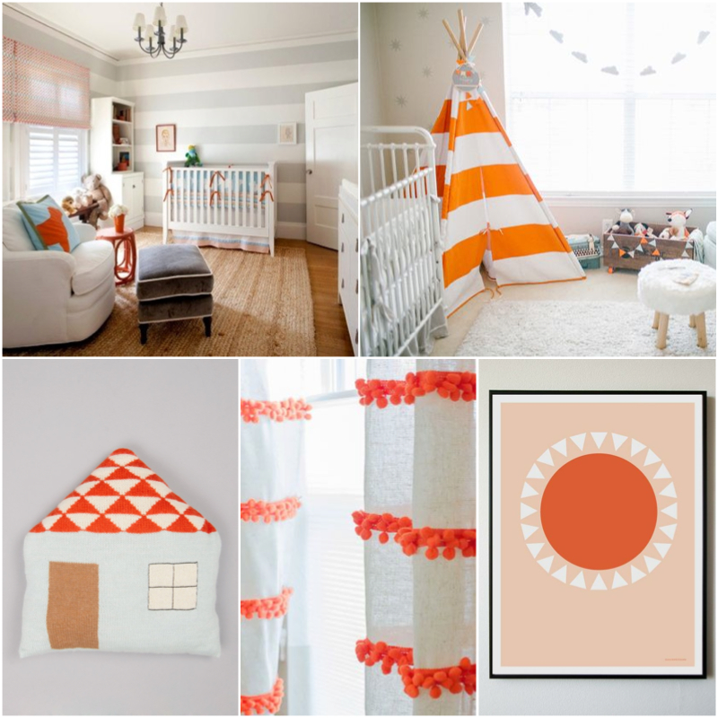
So, you want color – happy, fun, bold color… I say go for it! Here’s a hue that is gender neutral and easily works with other brights or muted tones.
Design Tip: If you’re looking for less color, choose subtle accents that only offer a small dose of bright. I suggest pairing brights with washed out pastels as seen in the plush house pillow above. This vibrant orange & soft blue is a great duo. Bonus: be sure to check out the DIY pom-pom curtain tutorial in the links below. I love it.
photo source / room one / room two / plush pillow / DIY pom curtain / sunburst art
Are you designing for baby? What color palette are you working with?
Comments are closed.


