June 25 2014
S Room Tour
When I have the chance to feature an interior project, it makes me happy. Especially when the space is designed for a little, because the design not only represents who they are now, but who they hope to be. It’s a pretty unique & awesome challenge and one that was perfectly met by designer Jennifer Tapper Richards. Here’s a tour of this delicate “little girl room” that’s inspired by New England and sweet dreams.
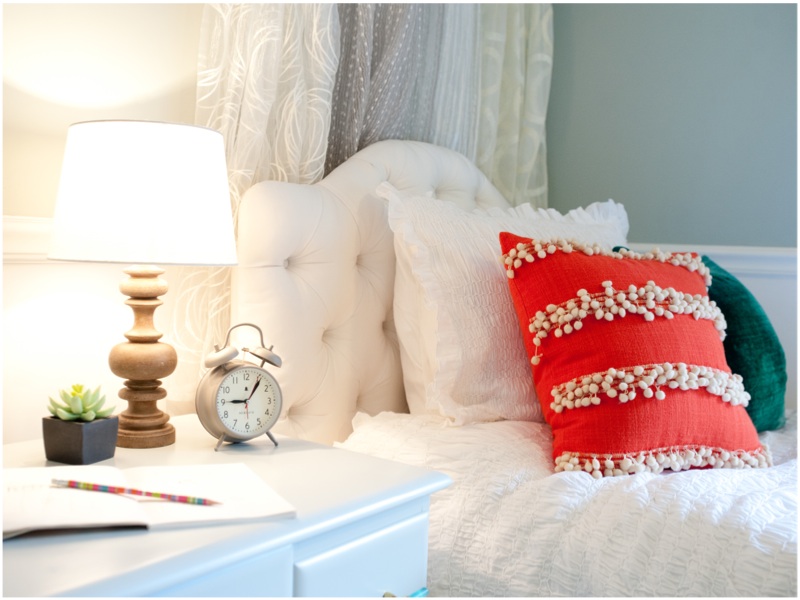
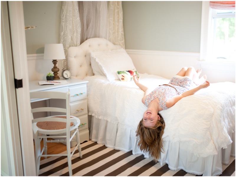
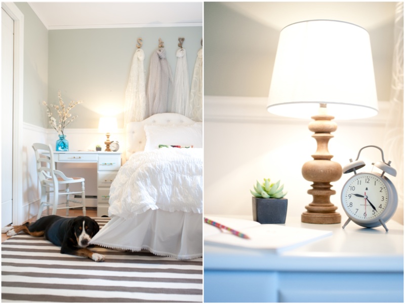
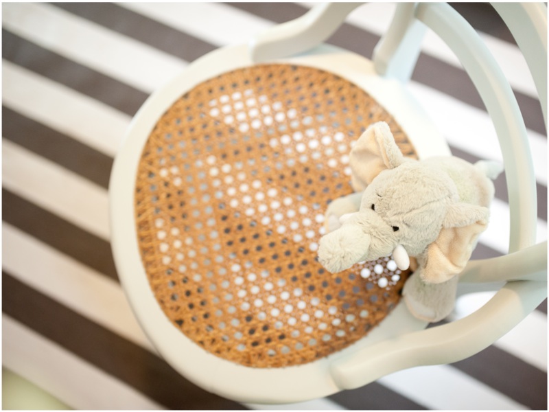
Overall theme for the space? The client wanted the space to feel like,“riding a horse on the beach at sunset”. We executed the Beach-at-Sunset vibe without being too literal. There is no blue and there are no shells or nautical inspired paraphernalia. However, the colors, shapes and materials are all there. The use of sheers and textural, light colored fabrics provide airiness. The serpentine front natural oak dresser adds a wavy quality, sandy color and grainy texture like veined beach pebbles and speckled shells. The light gray paint, (Benjamin Moore’s Gray Owl) selected to finish the desk and chairs, is the color of the clouds. The custom roman shades glow that beautiful warm orange of a summer sunset. The frosted glass desk hardware is a hint of sea glass, the white-washed, antiqued, turned wood desk lamp is reminiscent of driftwood, and the hand-caned chair seats maybe represent the natural fibers of the dunes. I’m literally just coming up with this descriptiveness now! How poetic (I can just hear my husband cracking up now). Haha, but it truly is amazing how something comes together when you have that imagery in mind as selections are made. So many beach-esque elements came through with great balance. The result is a fresh, warm space with an atmosphere that feels beachy instead of being an “I’m a beach” billboard.
How is Skye represented in the space? Skye’s Mom worked with me to create a room for Skye that reflected her personality. She is in all of the subtly unique details and design elements we selected – each item has a little twist that takes it one delicate step out of the mainstream. There is nothing cliché, formulaic or typical about Skye, her family, or the space. Mom has 3 kids yet drives a two-door Camaro. It isn’t a loud embellished red Camaro, but it’s still a Camaro. And she’s a Mom. And she is my idol.
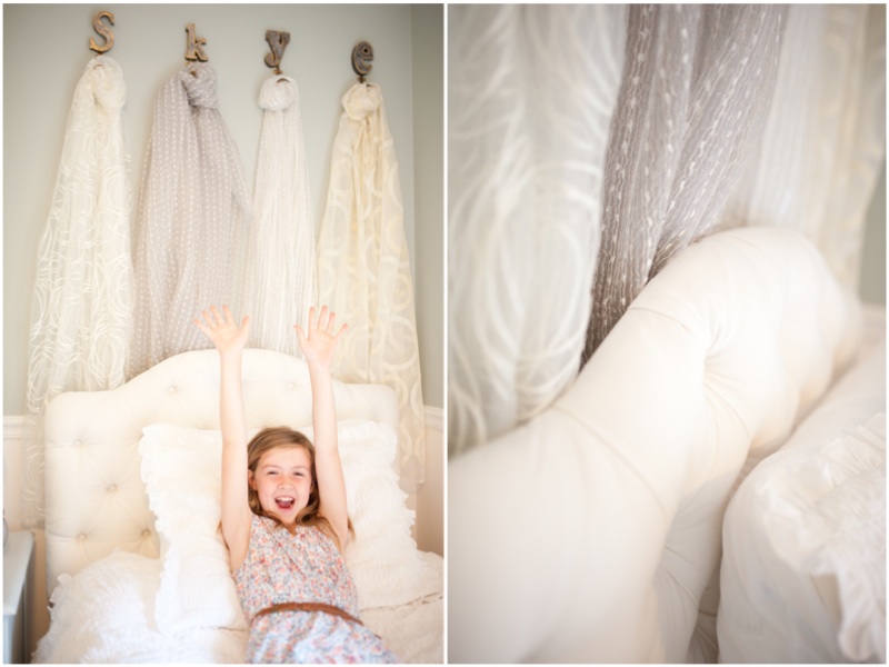
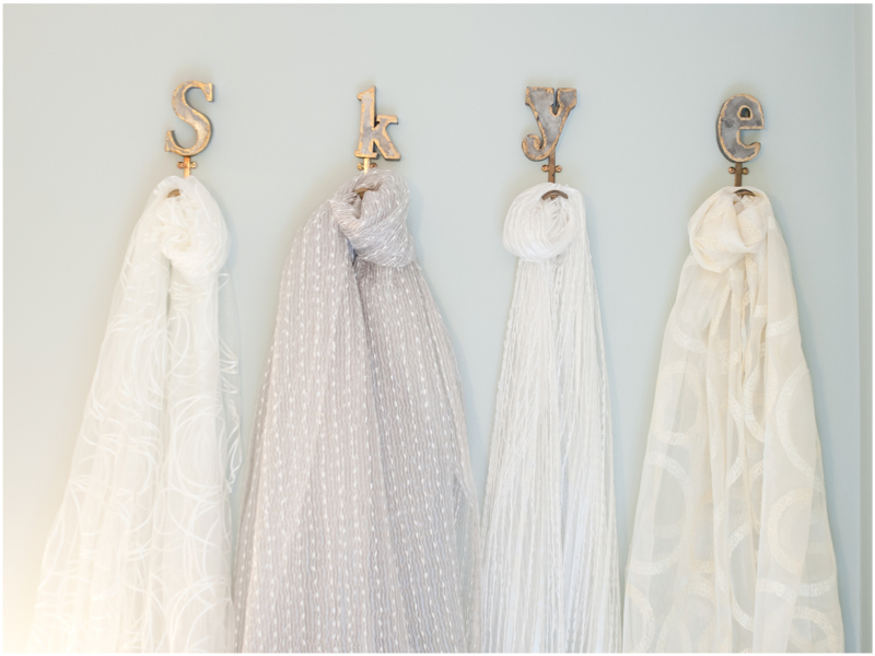
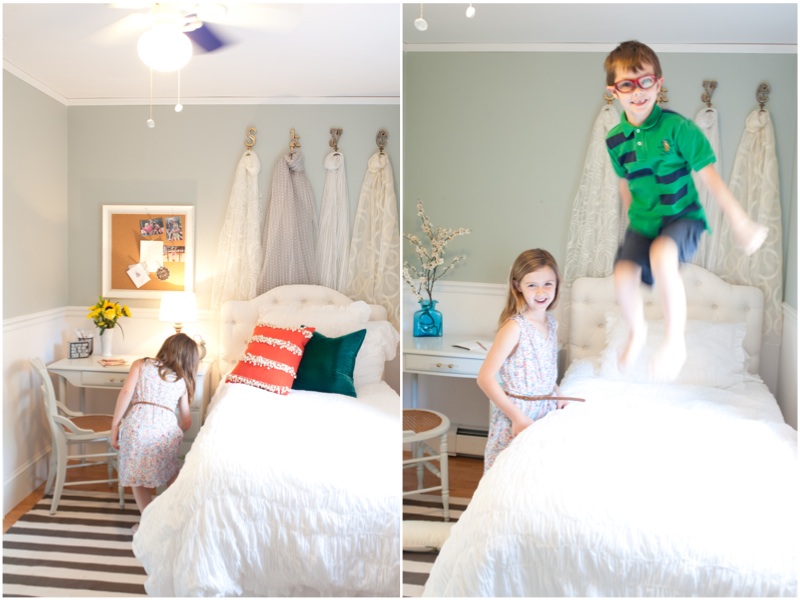
- The metal letter hooks that spell S-K-Y-E literally represent her. They are mounted high behind the bed to hold custom-made sheer scarves as wall décor – we selected four different sheers for variety, but kept it in the same color tone so it is still quietly full of character.
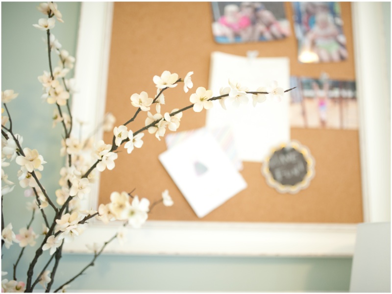
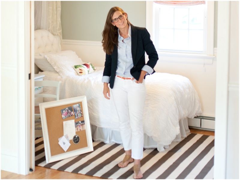
- The cork board’s mini paper airplane push pins just make you smile.
- The antique dresser doesn’t have just drawers – oh no, we couldn’t have that monotony. It also has a cabinet, which is perfect for some favorite books or a soccer ball.
- The desk and chairs were sourced from two different local antique shops and refinished in the same soft gray, which unifies them as a set, but ultimately it is a one-of-a-kind combo.
- We tricked out the desk with frosted glass and brass hardware in two different colors and painted the interior of the drawers a contrasting color for a rustic but polished detail.
- The Roman shades are custom made with three layers of fabric instead of the usual two. The first layer is an embroidered sheer which is both feminine and textural, the persimmon interlining lends depth and a gorgeous glow (like a sunset at the beach), and the back lining does the practical job of adding some room darkening and protecting the fabric on the front from sun damage. This is much more interesting than having a basic roman shade with a print and background color. Again, it’s just a little different than the norm, but tastefully done.
- The area rug is a resilient and durable, but also surprisingly soft indoor/outdoor stripe from Dash & Albert.
- The ruched duvet cover is perfect for a young girl’s room. It lends itself to the fastest bed-making possible. Nothing fussy allowed here. Jump out of bed and simply whip it up under the pillow and poof you have a made bed and instantly the whole room looks tidy!
What was the biggest design challenge? The room’s small size and long, narrow dimensions posed a bit of a challenge, but I love small spaces. The furniture was laid out and selected to be dual-purpose and provide much-needed storage. The desk serves as a work space as well as a nightstand, and the desk lamp pulls double duty too. The new desk and dresser provide additional excellent, purposeful storage. Also, selecting an area rug with horizontal stripes helped to make the room feel wider than it really is. In any small space, it’s important for the selections to be purposeful without being too attention-grabbing individually.
Now that the room is complete, the area/detail you love most? It’s a tough choice. I really love how the desk and chairs came out, but I have to say the Hooks and Sheers wall décor behind the headboard. The space wouldn’t be at the same level without it. There is so much texture, height, airiness, a little variety and a lot of depth created with that single element.
Local retailers you shopped from? I firmly believe spaces are made exponentially better by paying close attention to even the smallest details. In this case, the hardware on the refinished desk exemplifies that. My go-to for furniture bling, Kitchen & Bath Details in Mattapoisett, is fantastic. Jill Muldoon and her team listened to what I was looking for and pointed me towards the perfect hardware to finish off the desk. They design the grandest and most beautiful of kitchens and baths, but they also have so many options for small details – in this case hardware – for any project. They are always extremely helpful and resourceful.
Advice for parents looking to create this type of look in their home? Think about the atmosphere you want to create, not just a literal theme. It will help think a bit out of the box to translate the vibe into reality. Also, shop at a variety of stores, online vendors and local workrooms, and you will have a space that looks pulled-together but evolved. This room didn’t start with a typical “bedroom set,” and it did take some time to develop, but the results are so worth it. It’s more personal, timeless and rewarding that way. All of these pieces will grow with Skye and hopefully become some of her life-long treasures.
Other Resources:
- New Bedford Antiques at Wamsutta Place, New Bedford
- What a Find! Furniture Consignment, Fairhaven
- Kitchen & Bath Details, Mattapoisett
MoPa Preferred Vendors / interior design by Tapper Richards Interiros / photography by MOJAPHOTO
Comments are closed.


